Mio Activity Dashboard: Measure Cross-Platform Collaboration
Introducing the New Mio Activity Dashboard
Mio admins now have a clearer way to quantify the value of cross-platform collaboration across Microsoft Teams and Google Chat.
The new Mio Activity Dashboard brings cross-platform messaging, file sharing, active-user data, and collaboration trends into one centralized view. It helps admins understand both who is receiving value from Mio through active usage and where that value is being realized across direct messages, group chats, and channels.
With flexible date ranges, updated usage metrics, and easier-to-read visualizations, the dashboard is designed to help you understand how your organization is using Mio to collaborate across connected platforms.
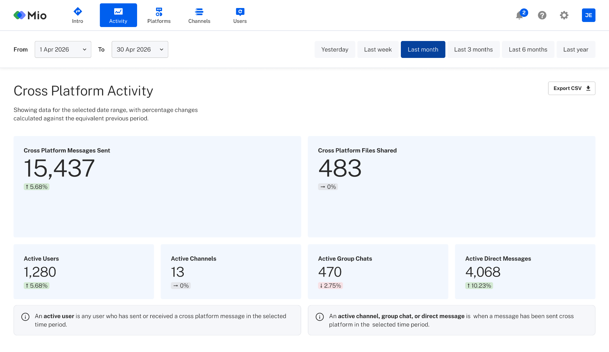
See Cross-Platform Collaboration in One Place
Organizations use Mio to connect employees who work across different collaboration platforms. One team may work in Microsoft Teams, while another uses Google Chat.
The Mio Activity Dashboard helps admins understand how that cross-platform collaboration is taking place.
Instead of relying on separate reports from each platform, Mio admins can view activity related specifically to conversations facilitated by Mio. This creates a more focused picture of how people are communicating across platform boundaries.
The dashboard includes data on:
- Cross-platform messages sent
- Cross-platform files shared
- Active users
- Active channels
- Active group chats
- Active direct messages
- Messages over time
- Usage activity over time
Together, these metrics provide a practical view of adoption and ongoing engagement across your connected collaboration platforms.
Explore Mio Usage Across Custom Date Ranges
Mio admins can review activity across a custom date range of up to six months.
This makes it easier to examine both short-term changes and longer-term usage patterns. For example, an admin might use the dashboard to evaluate activity following a company rollout, compare adoption across several months, or use the custom date ranges to generate monthly reports to demonstrate the value of Mio to their leadership.
Admins can choose from the following preset date ranges:
- Yesterday
- Last week
- Last month
- Last 3 months
- Last 6 months
These options make it easy to quickly review recent activity without manually configuring dates.
Understand Active Usage Across Your Organization
The updated dashboard focuses on the activity that demonstrates how Mio is being used across connected platforms.
An active user is a user who sent or received a cross-platform message during the selected date range.
This definition captures more than the people who actively initiate conversations. It also reflects the broader group of employees participating in cross-platform collaboration by receiving and responding to messages from colleagues on other platforms.
Admins can also see activity across channels, group chats, and direct messages. This metric, active chats, is a great indicator of where value is occurring.
Track Cross-Platform Messages and File Sharing
Messages are the foundation of collaboration, but many workplace conversations also depend on documents, images, presentations, and other shared files.
The Activity Dashboard includes separate metrics for cross-platform messages and files shared through Mio. These metrics can help admins understand the volume and type of collaboration taking place across platform boundaries.
For example, an organization may see steady message volume but a growing number of shared files. That pattern could indicate that employees are using Mio for increasingly substantive project collaboration rather than only short conversations.
By reviewing message and file-sharing activity together, admins can build a more complete picture of how teams are working across platforms.
Identify Usage Trends Over Time
The dashboard also includes two visual reports:
Messages Over Time
The Messages over time chart shows how cross-platform messaging volume changes throughout the selected date range.
Admins can use this view to identify increases, declines, and recurring patterns in message activity. A rise in messages may correspond with a new deployment, an organizational change, or increased collaboration between teams using different platforms.

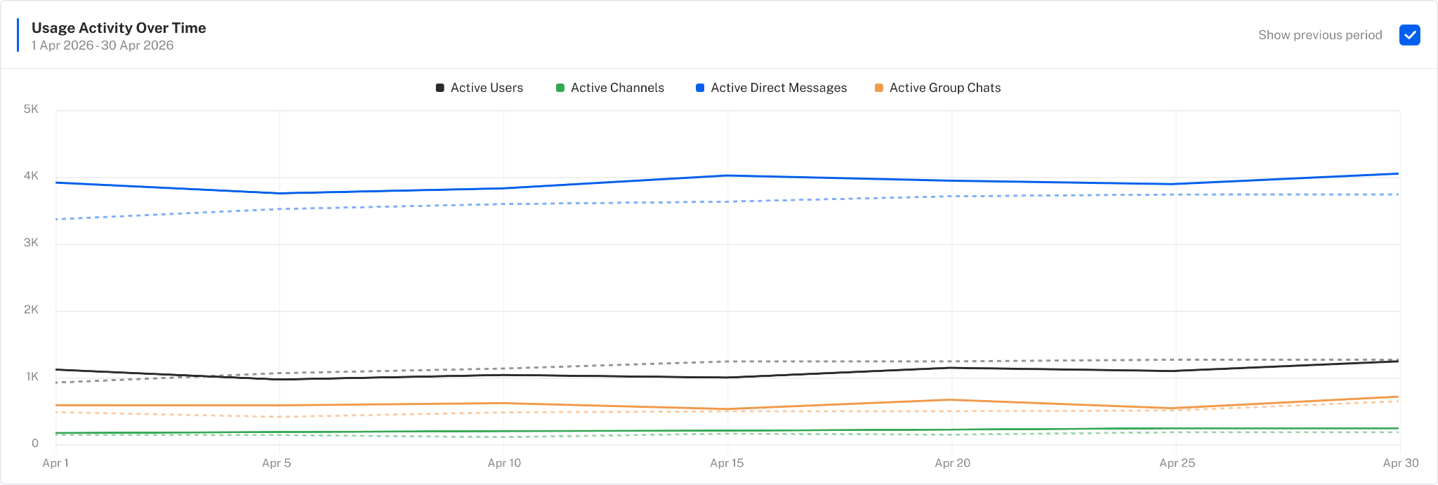
Usage Activity Over Time
The Usage activity over time chart provides a broader view of how active users and conversations change over time.
This can help admins distinguish between isolated activity and sustained adoption. Rather than looking only at a total number for the selected period, admins can see whether usage is consistent, growing, or concentrated around particular dates.
A Dashboard Focused on the Value Mio Provides
As part of this update, Mio removed redundant User Sync data that was previously available in the activity area.
User provisioning and synchronization information is already available in the Users tab of the Mio Hub. Keeping the same information in multiple locations made it harder to understand the purpose of each section.
The updated Activity Dashboard now focuses specifically on active cross-platform usage.
This separation gives each part of the Mio Hub a clearer purpose:
- The Users tab helps admins manage and review user provisioning.
- The Activity tab helps admins understand how Mio is being used.
The result is a cleaner dashboard centered on the value Mio delivers: enabling people to communicate and collaborate across platforms.
How Mio Admins Can Access the Activity Dashboard
To view the new dashboard:
- Log in to the Mio Hub.
- Select Activity from the navigation.
- Choose a preset date range or create a custom date range of up to six months.
- Review your organization’s cross-platform messages, files, active users, conversations, and usage trends.
The updated Activity Dashboard is available now to Mio admins.
Get the latest news from Mio in your inbox.


